Just like Hogwarts, Brambletye children are placed by our very own Sorting Hat into one of four houses; Drake, Marlborough, Nelson or Wellington. Children thoroughly enjoy competing in their houses for various sporting and academic accolades. Even though the children couldn’t compete on the playing field or in the House Shout in the Spring term, they still competed virtually for the ‘House Lockdown Cup’.
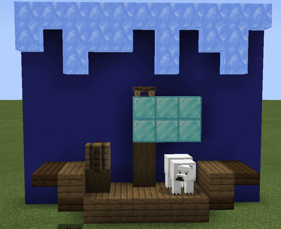
One recent challenge was to design a logo that the children felt represented their house and house values perfectly. From ducks to polar bears, wyverns to wellies, we really had it all! The entries were so creative and of a very high standard. The competition was judged by our very own Head of Art, Mr Holden who was extremely impressed.
And here are the results of the House Logo competition with comment from Mr Holden……..:
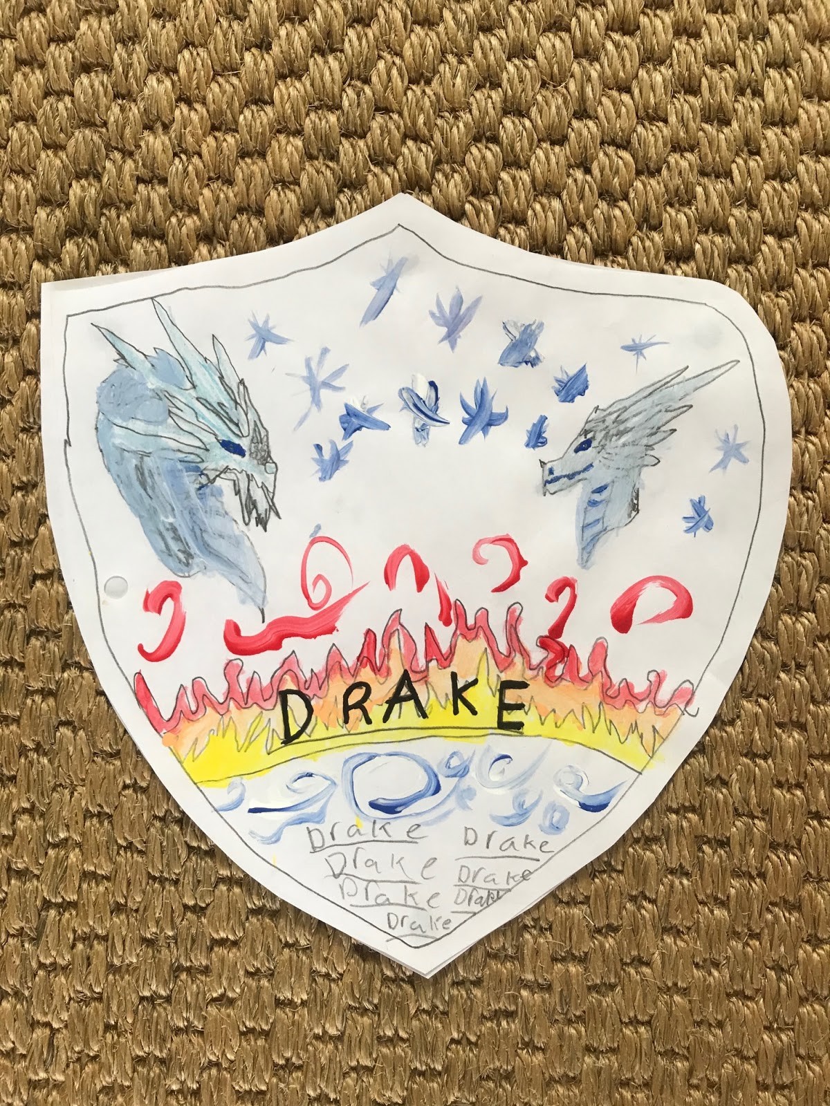
Drake Juniors – Ida
‘For her stunning use of freehand design and colour to create an energetic design.
Drake Seniors – Phoebe
‘For her Hilarious use of ducks as a background which actually creates a serious element to the competition in terms of working as a team.’
Nelson Juniors – Ethan
‘For his strong use of 3D Lego, especially the expressive dog which gives the impression of leadership. The design is beautifully executed.’
Nelson Seniors – Georgina
‘For her Excellent use of Pop Art to create repetition. The design draws you in and I want to look at it more and more. It is a great idea.’
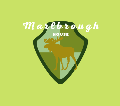
Marlborough Juniors – Coco
‘The simple designs are often the best and this is one of them. She has created an effective use of graphics.’
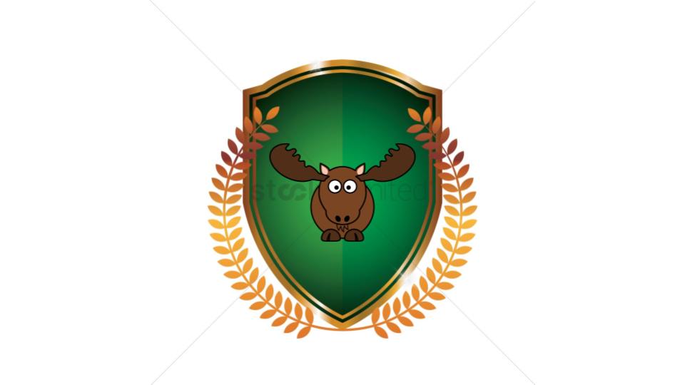
Marlborough Seniors – William
‘This is an Excellent design made so by a risky approach and expressive use of humour. Brilliantly funny!’
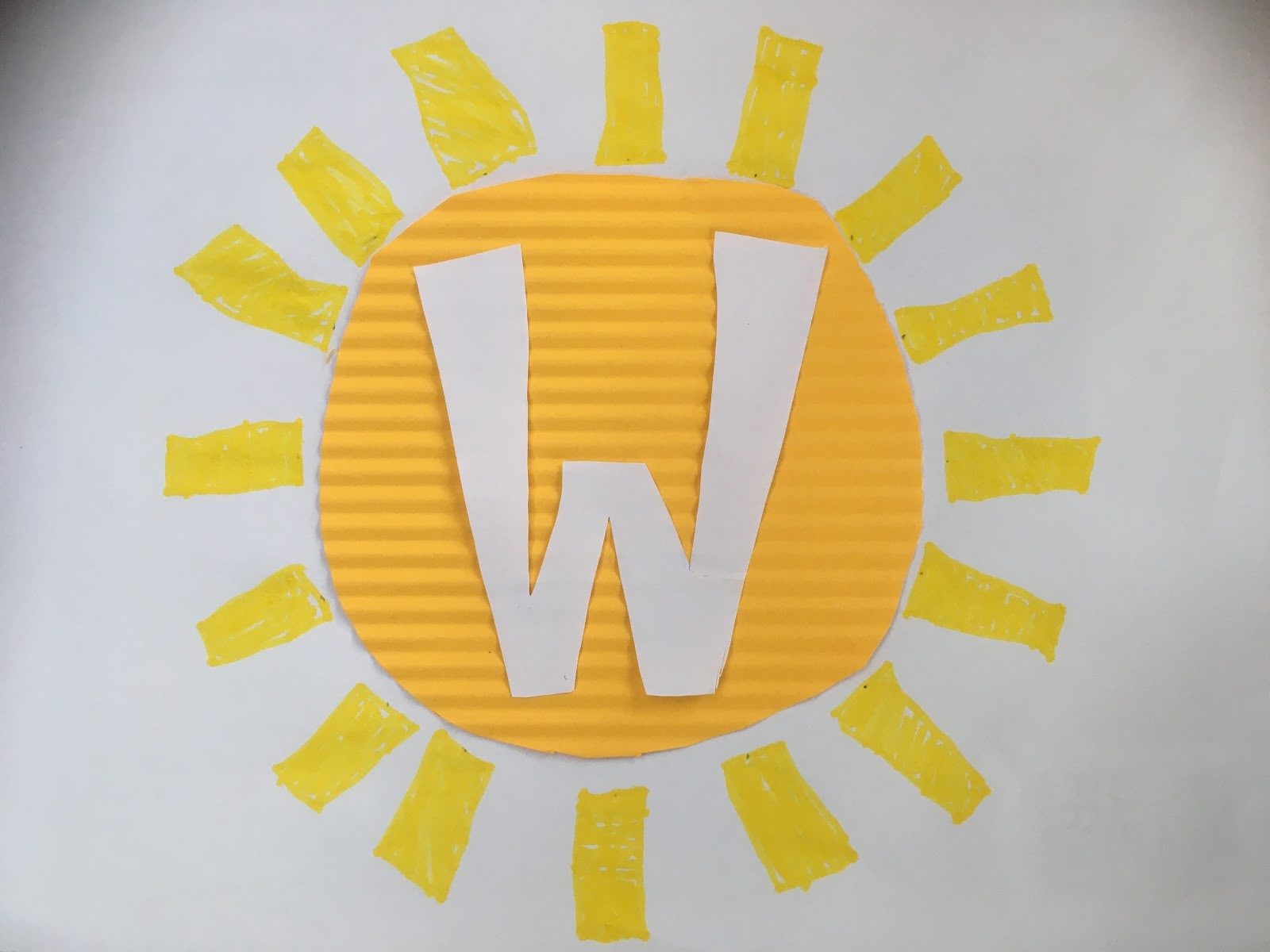
Wellington Juniors – Ben
‘A beautiful collage to create a unique outcome. Simple and infectious. A well-planned design.’
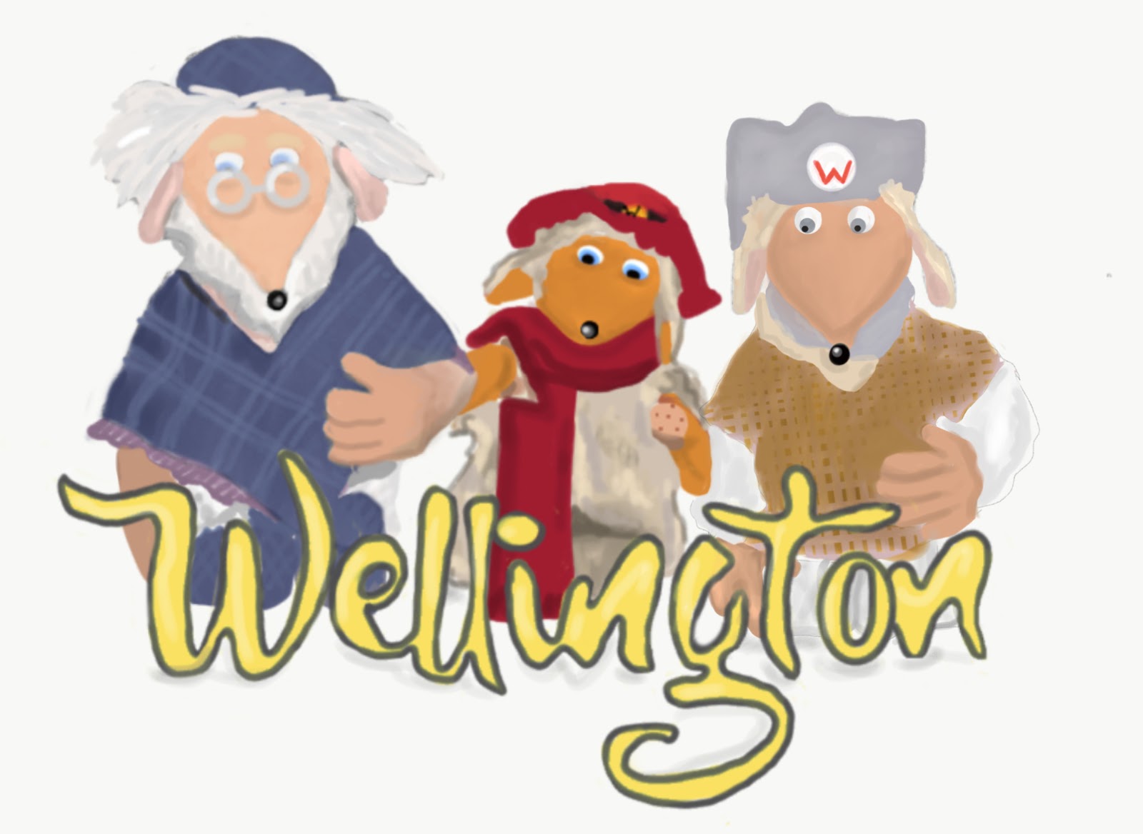
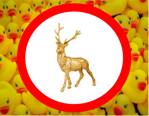
Wellington Seniors – Emilia
‘I love the Wombles to create a fun statement and great use of colour to create harmony. The design makes me feel happy!’
And the Overall Winner is…
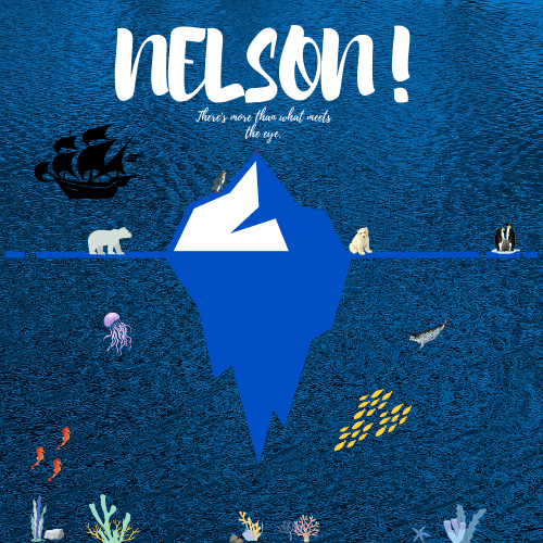
Robin from Nelson House
‘For the most powerful use of text to capture and demand my attention. ‘There’s more than what meets the eye’ combined with graphic images of wildlife creates a caring and thought-provoking house logo fit for print.’
Bring on next term when we hope to compete in Sport and on stage once more.
